
 在 Github 上查看源代码 在 Github 上查看源代码 |
|
概率主成分分析 (PCA) 是一种降维技术,它在较低维度的隐空间中分析数据(Tipping 和 Bishop,1999 年),通常在数据中缺少值或者进行多维标度时使用。
导入
import functools
import warnings

import matplotlib.pyplot as plt
import numpy as np
import seaborn as sns

import tensorflow.compat.v2 as tf
import tensorflow_probability as tfp

from tensorflow_probability import bijectors as tfb
from tensorflow_probability import distributions as tfd

tf.enable_v2_behavior()

plt.style.use("ggplot")
warnings.filterwarnings('ignore')
模型
假设有一个由 \(N\) 个数据点组成的数据集 \(\mathbf{X} = {\mathbf{x}_n}\),其中每个数据点均为 \(D\) 维,\(\mathbf{x}_n \in \mathbb{R}^D\)。我们的目标是使用较低维度 (\(K < D\)) 在隐变量 \(\mathbf{z}_n \in \mathbb{R}^K\) 下表示每个 \(\mathbf{x}_n\)。主轴集 \(\mathbf{W}\) 将隐变量与该数据相关联。
具体来说,我们假定每个隐变量为正态分布,
\[ \begin{equation*} \mathbf{z}_n \sim N(\mathbf{0}, \mathbf{I}). \end{equation*} \]
通过投影,生成相应的数据点,
\[ \begin{equation*} \mathbf{x}_n \mid \mathbf{z}_n \sim N(\mathbf{W}\mathbf{z}_n, \sigma^2\mathbf{I}), \end{equation*} \]
其中,矩阵 \(\mathbf{W}\in\mathbb{R}^{D\times K}\) 称为主轴。在概率 PCA 中,我们通常关注的是估计主轴 \(\mathbf{W}\) 和噪声项 \(\sigma^2\)。
概率 PCA 概括了经典 PCA。对隐变量进行边缘化处理后,每个数据点的分布为
\[ \begin{equation*} \mathbf{x}_n \sim N(\mathbf{0}, \mathbf{W}\mathbf{W}^\top + \sigma^2\mathbf{I}). \end{equation*} \]
当噪声的协方差变得无穷小 (\(\sigma^2 \to 0\)) 时,经典 PCA 就是概率 PCA 的特例。
我们按如下所述设置模型。在我们的分析中,我们假定 \(\sigma\) 已知,并且不将 \(\mathbf{W}\) 点估计为模型参数,而是对其使用先验,以便推断主轴的分布。我们将模型表示为 TFP JointDistribution,具体来说,我们将使用 JointDistributionCoroutineAutoBatched。
def probabilistic_pca(data_dim, latent_dim, num_datapoints, stddv_datapoints):
  w = yield tfd.Normal(loc=tf.zeros([data_dim, latent_dim]),
                 scale=2.0 * tf.ones([data_dim, latent_dim]),
                 name="w")
  z = yield tfd.Normal(loc=tf.zeros([latent_dim, num_datapoints]),
                 scale=tf.ones([latent_dim, num_datapoints]),
                 name="z")
  x = yield tfd.Normal(loc=tf.matmul(w, z),
                       scale=stddv_datapoints,
                       name="x")
num_datapoints = 5000
data_dim = 2
latent_dim = 1
stddv_datapoints = 0.5

concrete_ppca_model = functools.partial(probabilistic_pca,
    data_dim=data_dim,
    latent_dim=latent_dim,
    num_datapoints=num_datapoints,
    stddv_datapoints=stddv_datapoints)

model = tfd.JointDistributionCoroutineAutoBatched(concrete_ppca_model)
数据
我们可以使用模型从联合先验分布中抽样,从而生成数据。
actual_w, actual_z, x_train = model.sample()

print("Principal axes:")
print(actual_w)
Principal axes:
tf.Tensor(
[[ 2.2801023]
 [-1.1619819]], shape=(2, 1), dtype=float32)
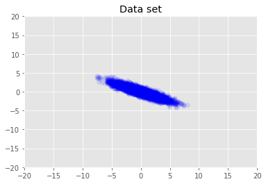
我们呈现数据集。
plt.scatter(x_train[0, :], x_train[1, :], color='blue', alpha=0.1)
plt.axis([-20, 20, -20, 20])
plt.title("Data set")
plt.show()
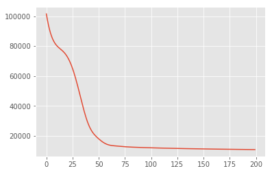
最大后验概率推断
首先,我们搜索隐变量中尽可能增加后验概率密度的点估计值。这称为最大后验概率 (MAP) 推断,操作方法是计算尽可能增加后验密度 \(p(\mathbf{W}, \mathbf{Z} \mid \mathbf{X}) \propto p(\mathbf{W}, \mathbf{Z}, \mathbf{X})\) 的 \(\mathbf{W}\) 和 \(\mathbf{Z}\) 的值。
w = tf.Variable(tf.random.normal([data_dim, latent_dim]))
z = tf.Variable(tf.random.normal([latent_dim, num_datapoints]))

target_log_prob_fn = lambda w, z: model.log_prob((w, z, x_train))
losses = tfp.math.minimize(
    lambda: -target_log_prob_fn(w, z),
    optimizer=tf.optimizers.Adam(learning_rate=0.05),
    num_steps=200)
plt.plot(losses)
[<matplotlib.lines.Line2D at 0x7f19897a42e8>]
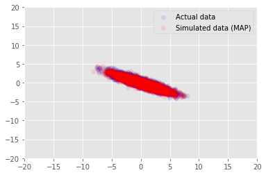
我们可以使用该模型为 \(\mathbf{W}\) 和 \(\mathbf{Z}\) 抽取已推断值的数据,并与我们作为条件的实际数据集进行对比。
print("MAP-estimated axes:")
print(w)

_, _, x_generated = model.sample(value=(w, z, None))

plt.scatter(x_train[0, :], x_train[1, :], color='blue', alpha=0.1, label='Actual data')
plt.scatter(x_generated[0, :], x_generated[1, :], color='red', alpha=0.1, label='Simulated data (MAP)')
plt.legend()
plt.axis([-20, 20, -20, 20])
plt.show()
MAP-estimated axes:
<tf.Variable 'Variable:0' shape=(2, 1) dtype=float32, numpy=
array([[ 2.9135954],
       [-1.4826864]], dtype=float32)>
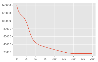
变分推断
可以使用 MAP 查找后验分布的模式(或其中一种模式),但 MAP 不提供关于该模式的任何其他见解。接下来,我们使用变分推断,在该推断中,使用由 \(\boldsymbol{\lambda}\) 参数化的变分分布 \(q(\mathbf{W}, \mathbf{Z})\) 来逼近后验分布 \(p(\mathbf{W}, \mathbf{Z} \mid \mathbf{X})\)。目的是查找变分参数 \(\boldsymbol{\lambda}\),这些参数会尽可能减少 q 与后验之间的 KL 散度 \(\mathrm{KL}(q(\mathbf{W}, \mathbf{Z}) \mid\mid p(\mathbf{W}, \mathbf{Z} \mid \mathbf{X}))\),或者相当于尽可能增加证据下限 \(\mathbb{E}_{q(\mathbf{W},\mathbf{Z};\boldsymbol{\lambda})}\left[ \log p(\mathbf{W},\mathbf{Z},\mathbf{X}) - \log q(\mathbf{W},\mathbf{Z}; \boldsymbol{\lambda}) \right]\)。
qw_mean = tf.Variable(tf.random.normal([data_dim, latent_dim]))
qz_mean = tf.Variable(tf.random.normal([latent_dim, num_datapoints]))
qw_stddv = tfp.util.TransformedVariable(1e-4 * tf.ones([data_dim, latent_dim]),
                                        bijector=tfb.Softplus())
qz_stddv = tfp.util.TransformedVariable(
    1e-4 * tf.ones([latent_dim, num_datapoints]),
    bijector=tfb.Softplus())
def factored_normal_variational_model():
  qw = yield tfd.Normal(loc=qw_mean, scale=qw_stddv, name="qw")
  qz = yield tfd.Normal(loc=qz_mean, scale=qz_stddv, name="qz")

surrogate_posterior = tfd.JointDistributionCoroutineAutoBatched(
    factored_normal_variational_model)

losses = tfp.vi.fit_surrogate_posterior(
    target_log_prob_fn,
    surrogate_posterior=surrogate_posterior,
    optimizer=tf.optimizers.Adam(learning_rate=0.05),
    num_steps=200)
print("Inferred axes:")
print(qw_mean)
print("Standard Deviation:")
print(qw_stddv)

plt.plot(losses)
plt.show()
Inferred axes:
<tf.Variable 'Variable:0' shape=(2, 1) dtype=float32, numpy=
array([[ 2.4168603],
       [-1.2236133]], dtype=float32)>
Standard Deviation:
<TransformedVariable: dtype=float32, shape=[2, 1], fn="softplus", numpy=
array([[0.0042499 ],
       [0.00598824]], dtype=float32)>
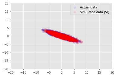
posterior_samples = surrogate_posterior.sample(50)
_, _, x_generated = model.sample(value=(posterior_samples))

# It's a pain to plot all 5000 points for each of our 50 posterior samples, so
# let's subsample to get the gist of the distribution.
x_generated = tf.reshape(tf.transpose(x_generated, [1, 0, 2]), (2, -1))[:, ::47]

plt.scatter(x_train[0, :], x_train[1, :], color='blue', alpha=0.1, label='Actual data')
plt.scatter(x_generated[0, :], x_generated[1, :], color='red', alpha=0.1, label='Simulated data (VI)')
plt.legend()
plt.axis([-20, 20, -20, 20])
plt.show()
致谢
本教程最初用 Edward 1.0编写(源代码)。我们在此向编写和修订该版本的所有贡献者表示感谢。
参考文献
[1]: Michael E. Tipping and Christopher M. Bishop. Probabilistic principal component analysis. Journal of the Royal Statistical Society: Series B (Statistical Methodology), 61(3): 611-622, 1999.